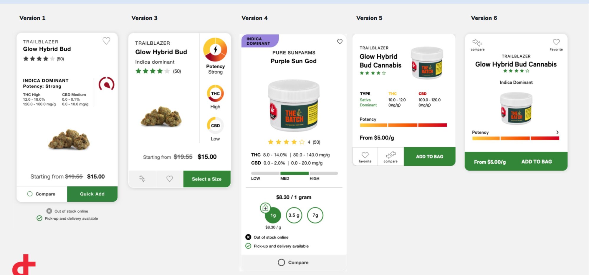
// Figure 01 Six card variants — each tested a different information hierarchy against real traffic
A picture is usually worth a thousand words. In cannabis, it's worth almost nothing. Research surfaced the real decision factors — THC, CBD, lineage, price — and we elevated them to the forefront of every product listing.
Product listing pages across ecommerce traditionally rely on product imagery for user selection. A user sees a photo, recognizes the product, and decides. The entire pattern of ecommerce is built on that assumption.
In cannabis, it breaks.
Most cannabis buds look remarkably similar. Oils look like other oils. Edibles look like other edibles. Images couldn't meaningfully differentiate products — and research surfaced the data buyers actually used to decide:
None of that was surfaceable in a traditional product card.
We applied the APEX framework directly. Audience segmentation (new users, regulars, medicinal buyers). Product hierarchy (which data point leads the card, which supports). Experience testing (6 variants, A/B tested with real OCS traffic).
Each variant experimented with a different information hierarchy — some lead with potency indicators, some lead with lineage badges, some lead with per-gram pricing. The winning variant combined the clearest data with the cleanest visual affordance for add-to-cart.
The redesigned product listing pages drove a 62% increase in add-to-cart rate — a dramatic step-change in how users moved through the discovery flow.
The work was recognized with two UX industry awards:
More importantly, the pattern became a reference point for how regulated-category ecommerce (where imagery fails and compliance matters) can surface decision-critical data without sacrificing aesthetics or usability.